One Platform: Partner Experience Redesign
OVERVIEW
Four focus areas out of one discovery.
One Platform is the tooling Rokt's business runs on — Account Managers, Operations, and Product use it every day to configure, manage, and measure experiences on both the partner and advertiser sides. I joined the Partner Activation & Success team without a brief. The work was open-ended, and what I came back with was a full strategy doc: a discovery that diagnosed why the platform felt broken, a reframe that changed how the team evaluated new work, and four focus areas that came out of it — a Unified Performance Dashboard, an Optimization Hub, Controls Configuration Guardrails, and an Information Architecture rework. Three shipped. All four were prioritized onto the Q1/Q2 roadmap.
THE PROBLEM
The growth infrastructure was blocking growth.
Every new partner and every new product launch runs through One Platform. The long-term vision was self-serve — partners configuring and managing their own experiences without internal teams in the loop. The current foundation couldn't get there. The platform was powerful, but each area was owned by a different product team, so even though everything lived in one place, using it felt like using several different products. AMs tool-hopped to do one job. Configuration was slow and error-prone. And the business was about to launch new products on top of something already fragile.
The structural reason sits underneath all of it. Setting up an experience on a partner's site means configuring four interconnected objects — Page, Layout, Controls, and Audiences — in a non-linear sequence. Each can be configured on its own, but they all have to connect in the end. And the relationships aren't one-to-one: a single layout might map to many controls, one audience to many pages. Real structural complexity, and nothing in the interface showed how any of it related. Without that, the platform wasn't just unintuitive. It was genuinely hard to use, correctly, by people whose job it was.
IMPACT
What changed: Unified Performance Dashboard, Optimization Hub, Controls Configuration Guardrails, Side Nav (Information Architecture)
Configuration time · 1–2 hrs → under 1 hr Debug cycles · a 1–2 hr error-recovery loop, removed Revenue protected · thousands weekly, caught pre-launch Roadmap · 4 of 4 design-led directions prioritized for Q1/Q2. The speed number is the least interesting part. Configuration errors used to trigger a one-to-two-hour debug cycle that pulled in the Operations team — so templates and validation didn't just save one person's time, they removed a whole team's firefighting.
THE DISCOVERY
Every role had a different mental model of the same platform
I ran interview sessions with AMs, Operations, and Product to understand how each group actually used the tooling, then mapped the full journey for every user type across every phase — configuration through performance monitoring. I used AI actively for synthesis and clustering, to get to signal faster without skipping the thinking.
The map surfaced something no individual feature request could have. The four roles held completely different mental models of the same platform. An AM thought in accounts and clients. Operations thought in configuration objects. Product thought in surfaces and releases.
The platform's structure reflected Product's model — which is why it felt coherent to the people who built it and opaque to everyone else. That was the moment the diagnosis changed.
THE REFRAME
It wasn't a UI problem — it was a mental model problem.
I brought the discovery doc and early directions to the team with one pitch: stop treating this as a list of features to fix. Treat the whole platform as a product — a coherent mental model, a shared vision, and design principles, so the platform works the way users actually think rather than the way it was built. That framing did more work than any artifact I produced. It gave the team a way to evaluate proposals that wasn't "is this a good feature" but "does this reinforce the model or fragment it further."
FOCUS AREAS
The four focus areas weren't a wish list. Each one is a stage of the journey map where the mental-model gap was costing the most, and together they form a sequence that mirrors how the work actually happens:
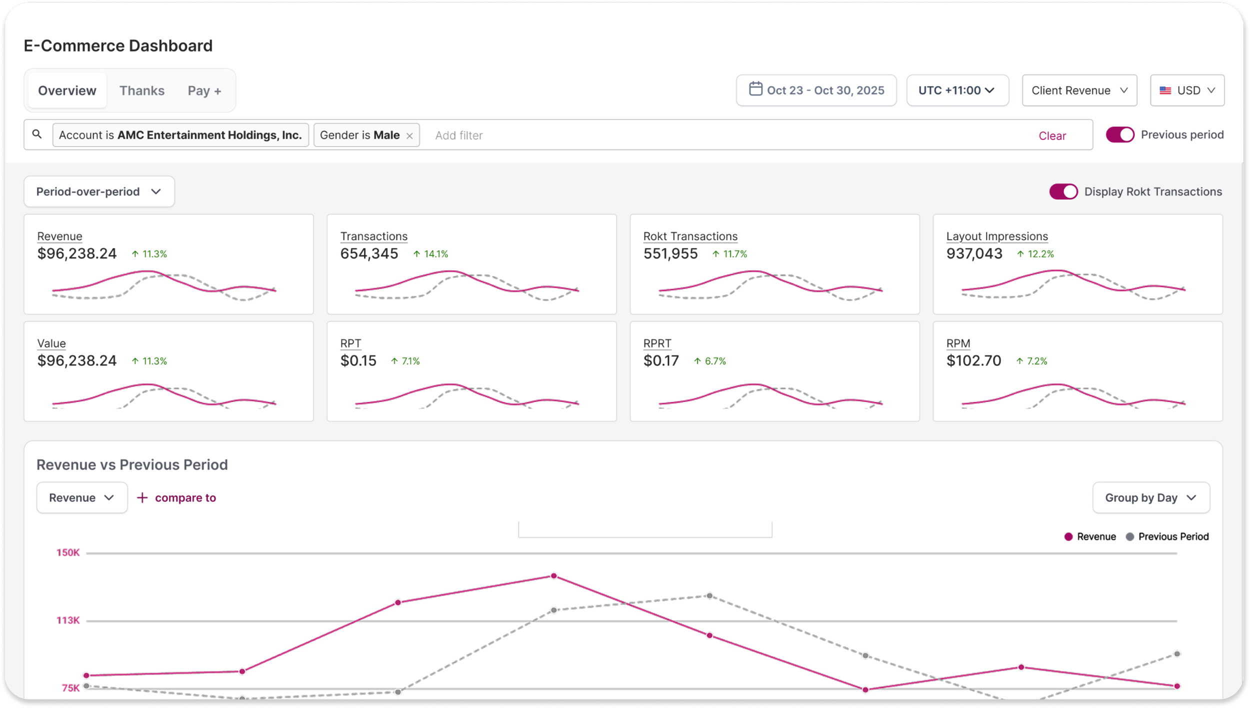
See what's happening → the Dashboard, replacing the copy-paste-into-spreadsheets ritual before client reviews.
Decide what to do about it → the Optimization Hub, because a clear picture of performance immediately raises the question of what to change.
Change it without breaking anything → Controls Guardrails, the point in the journey where a mistake costs a partner real money.
Find your way through all of it → Information Architecture, the layer that determines whether the other three feel like one product or three more tools.
UNIFIED PERFORMANCE DASHBOARD
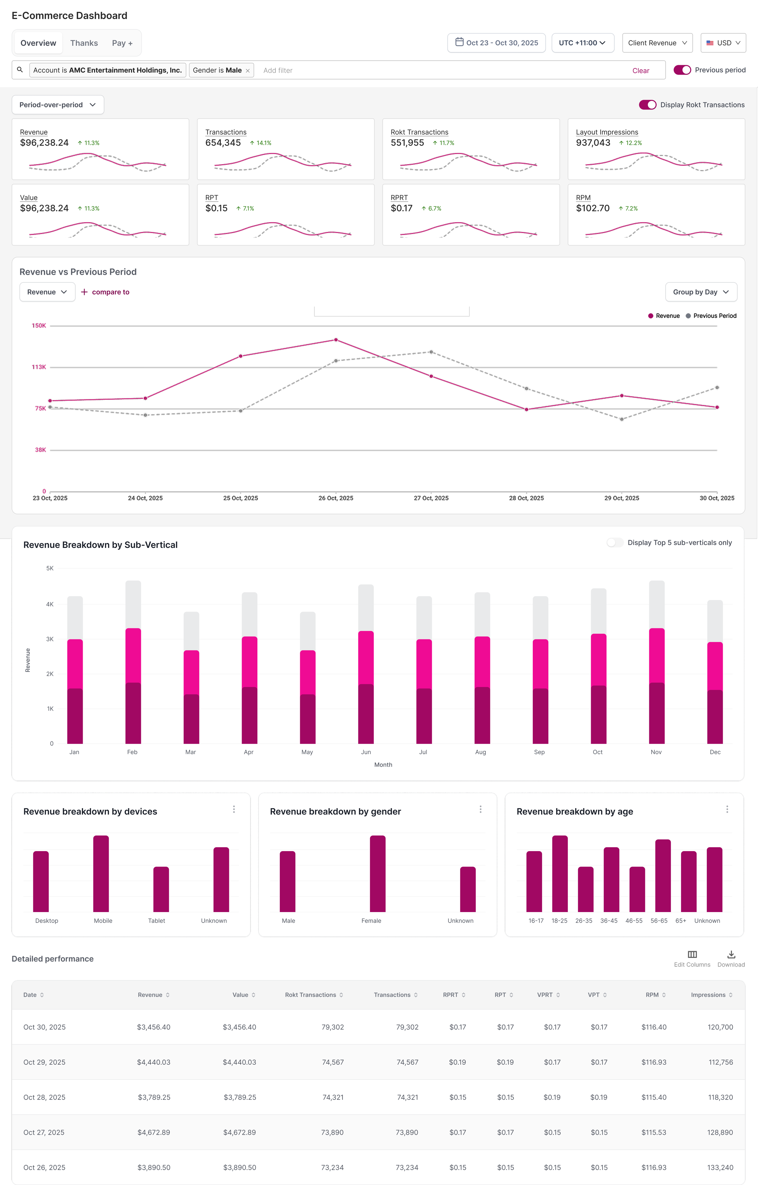
AMs were copy-pasting data from several places into spreadsheets to prepare for client reviews.
I explored three directions. A single overview with no tabs was the cleanest, and it lost product-level comparison — the thing AMs needed most. A version without the data table reduced visual load, but AMs relied on that table live on client calls; removing it optimized the screenshot and broke the meeting.
I landed on a tabbed structure with the full table: Overview as the glanceable layer, tabs for per-product focus. It's more complex than either exploration. That was the trade — the simpler versions were better designs of the wrong thing, and matching how AMs actually work mattered more than the cleaner comp.
OPTIMIZATION HUB
Knowing what happened isn't knowing what to do.
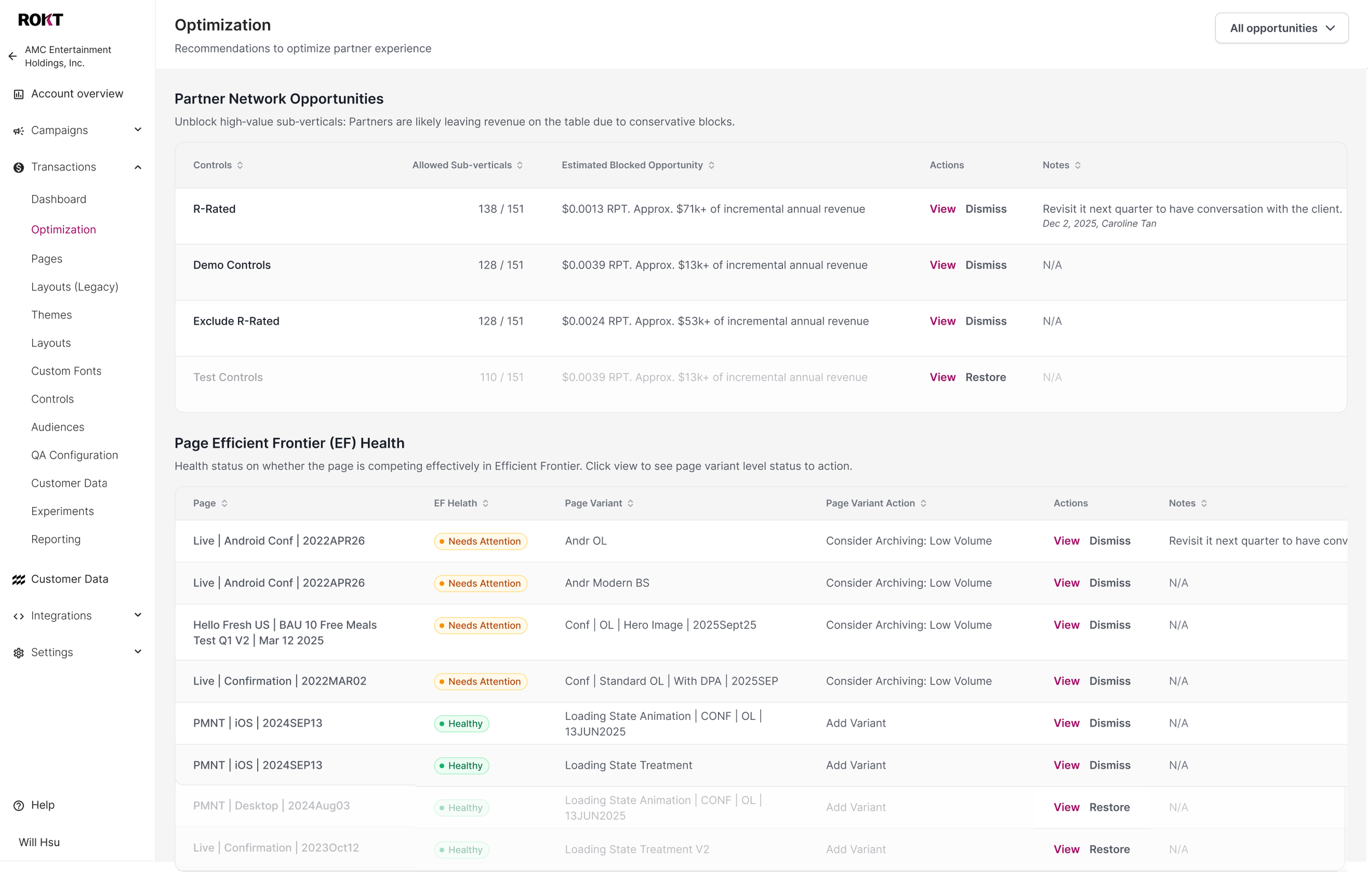
There was no systematic way for an AM to know what to optimize. Useful signals existed — underperforming controls, targeting opportunities, variant suggestions — but they were siloed across separate pages, so acting on them depended on someone happening to notice.
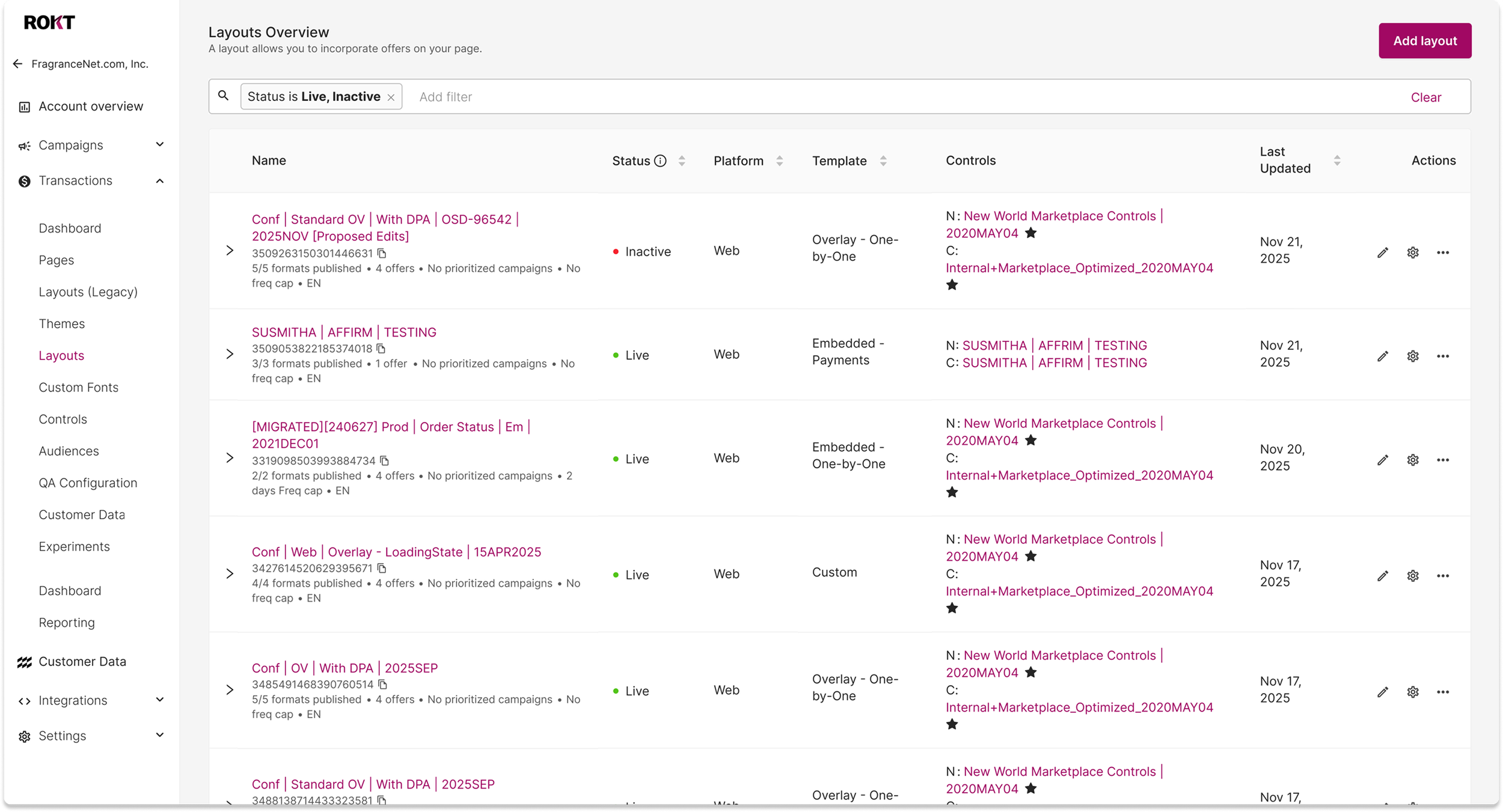
This is the product-over-toolset thinking made concrete. I pulled the recommendations into one hub positioned directly after the Dashboard, so the flow reads as understand your performance, then see what to do about it rather than two unrelated destinations. Each recommendation carries an estimated revenue opportunity attached to a specific, reversible action — one blocked sub-vertical surfaced roughly $71k of incremental annual revenue at current RPT.
CONTROLS CONFIGURATION GUARDRAILS
Warn them after, or guide them from the start
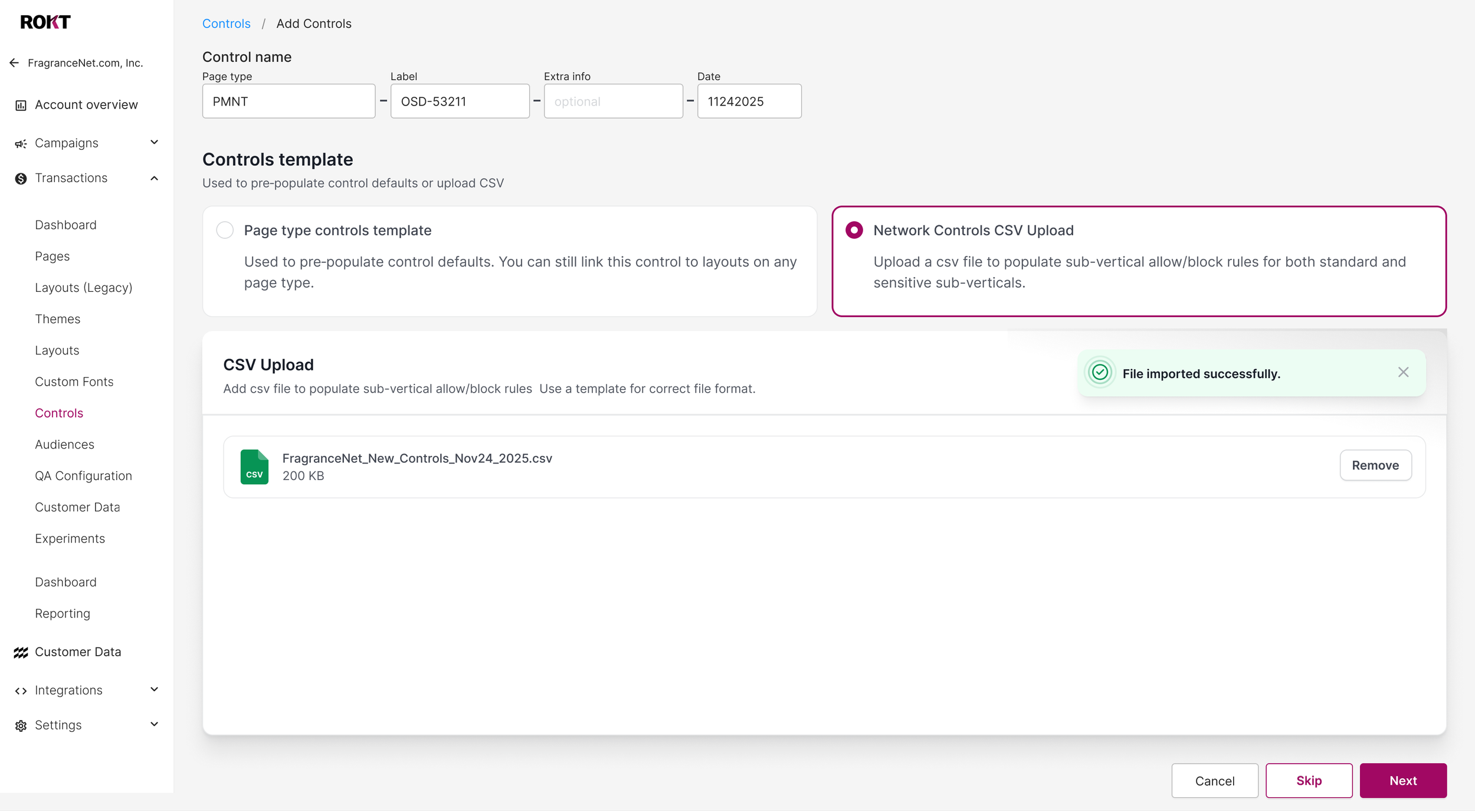
Errors here weren't UX problems. A single mis-configured sub-vertical could cost a partner thousands in lost revenue inside a week, in the most sensitive area of the platform.
That made the core decision explicit: warn users after they make a mistake, or guide them so the mistake is harder to make. Warning is cheaper to build and it puts the burden of correctness on the person least equipped to carry it — someone configuring an object whose downstream relationships the interface never showed them.
We chose guardrails. Validation in the flow, naming conventions enforced at creation, CSV upload with format checking. It sped up control creation and cut the surface area for manual-input error at the same time.
INFORMATION ARCHITECTURE
Fewer clicks isn't better UX.
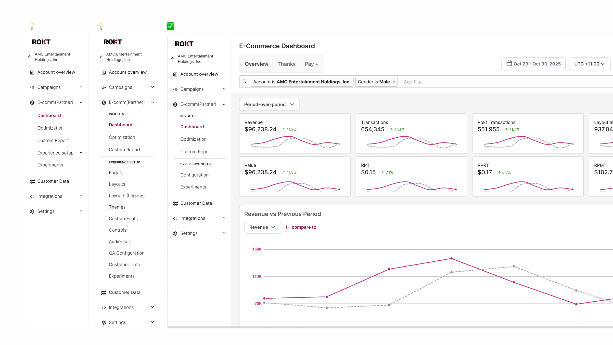
The navigation mirrored how the platform was built, not how users think. I explored three directions and rejected the first two for the same underlying reason.
Nesting setup inside a dropdown was the cheapest fix. It's a layer inside a layer — it hides the problem rather than solving it.
Splitting into Insights and Experience Setup created clearer spaces, and it still didn't show how the objects relate to each other. That's when the real issue got specific: the problem was never labeling. It's that these four objects are deeply related but configured individually, and no structure reflected that.
So I landed on a dedicated Configuration space — when someone sets up an experience, there's one place that holds the related pieces together, organized around what the user is trying to do rather than around object categories.
The trade-off is real: it adds a click to reach each section. But "fewer clicks equals better UX" doesn't apply here. The right grouping guides someone to the right place, and that's worth more than a saved click — the same reframe as the whole project, organizing around how the user thinks rather than how the system was built.
This direction was later de-scoped as priorities shifted.
WHAT OUTLASTED THE PROJECTS
The reframe kept working after the roadmap moved on
The vocabulary stuck. "Stop adding tools, start building a product" became the team's shared reference for how new work gets evaluated — a product vision rather than a feature list. That mindset shift is the outcome I'm proudest of, because it keeps operating after the designer moves on.
The work earned a seat at the customer's table. An AM I'd worked with invited us to preview the roadmap at their GTM Monthly. The room got excited, which told me we weren't just building better tooling — we were building something people cared about.